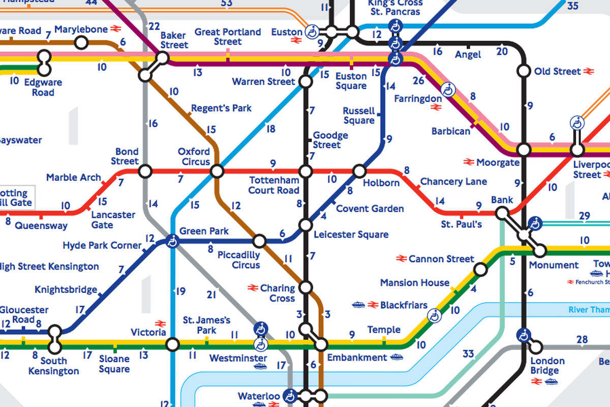
Learn the story of one of the best “user interfaces” before UI.
The London Tube Map.
The implications of this design are so profond, in terms of usage, perception, usage, and probably real estate prices.
Can the same thinking change the wine from France?